Hey, that’s my line! But the 2013 version of SharePoint also tells me that it is working on it, when it is loading a page or processing a change.
It is good to know that my team site is working on it. And it is even better that the team site allows me to be working on the content that I come here for.
One of my gripes with the team sites we now have in SharePoint 2010 (Online) is that my working area is too small.The Quick Launch menu is very useful, but it is in the way when I have list and libary views with many columns.
In the new SharePoint 2013, you can click on the icon Focus on content. That moves the menu out of the way, so can use the full width of the screen as a working area:
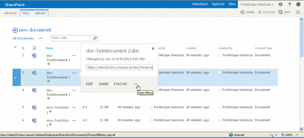
The interface for working on your documents has changed a bit as well. Instead of that menu that you can pull from the arrow that appears when you hover over the title or filename, we now have these dots… that indicate that you can do something… working on it…


You make it sound so negative… dots normally don’t indicate the you can do “something”, but that there is more to be explored. As that alt text already tells you, there are additional menu options.
Comment by Mike — October 4, 2012 @ 06:56
Ha ha, interesting that you interpret the text with the the dots as negative. I agree, it does look a bit odd. Dots to me are either “et cetera, et cetera…, we could keep enumerating but we won’t”. Or “well, I won’t say more about this, fading into silence…” That is why I find dots less suitable than an arrow to indicate “click here to take action”.
What I DO like about the dots, and like a lot, is that they are always visible, not just when you move your cursor over de filename or something, That was always hard to explain to innocent users.
The dots are a change, which we will have to explain to users in any case. But we can do that 🙂
Comment by frederique — October 5, 2012 @ 08:35
For me “that indicate that you can do something… working on it…” didn’t sound as if you where happy with it 🙂 In addition, I think I have to correct myself, it doesn’t indicate that there is more to be explored, but in fact there is something missing, an omission: http://en.wikipedia.org/wiki/Ellipsis Anyhow I think it is the right visual clue to indicate there is more. The option for the arrow is an interesting one, but at what direction do you want to have the arrow point to?
Comment by Mike — October 8, 2012 @ 07:33