blog.frederique.harmsze.nl my world of work and user experiences

February 29, 2016

The best intranets of 2016

Filed under: Usability — Tags: — frederique @ 21:50

The Intranet Design Annual written by the Nielsen Norman group is a yearly treat. The report takes us behind the scenes of the ten best intranets of this year. It not only shows and explains the intranets, which normally we do not have access to, but it also discusses the design process and the lessons learned. Good stuff! These are the things that struck me at first glance in the report.

Themes and trends

  • SharePoint rules!
    Of the 10 intranet winners of 2016, 7 are based on SharePoint 2013, 1 on SharePoint Online (Office 365), 1 on SharePoint 2013 mixed another system, and only 1 has nothing to do with SharePoint at all.
    I work for a Microsoft oriented company, so the intranets I am involved in always use one version of SharePoint or another. Sometimes we grumble at SharePoint, when it does not do what we want. But now nobody can claim that SharePoint is unsuited as a platform for great intranets.
  • Understanding employees
    It cannot be stressed enough: the only way to design a great intranet is to understand what the users need and then make it happen. The winners used different methods, but they all did something to involve the users in the design process. Even the team that had to create a new intranet in 60 days… The winners’ methods included analytics, interviews, surveys, “Listening Labs” to observe users at their desktop, early usability testing to define the Information Architecture and personas.
    This one struck me, because I recently heard – again – that we do not have time to involve users or to find out what they need. But if we don’t at least get some idea of what they users really need, how do we know we are not wasting our time on a useless intranet?
  • Content clean-up
    You won’t end up with a great new intranet if you migrate all old content that has gathered over the years ‘as is’. The redesign of your intranet is a good opportunity to clean up the content.  You need to analyse your content, determine what the helpful content is, design a structure to make that content easy to find., and plan the migration of the different types of useful information. One winner found that in their staged migration, the content that was planned for later stages was no longer relevant after all.
    This one resonates with me, because currently I am involved in a migration project. We are trying to avoid the ‘garbage in, garbage out’ approach. But because of time and technology constraints we unfortunately have to migrate a lot of sites ‘as is’. But fortunately, we have some governance in place that has already allowed us to remove obsolete sites earlier. And we plan on having even stronger governance in the new situation, to keep our environment clean. After all, you don’t have to wait for a migration to clean up your environment.
  • Helpful Help
    Over the years Help had become unfashionable, because it was unhelpful. But this year’s winners do offer help. Even though the intranets are clear enough to use intuitively without help, the teams realised that some users need some guidance to feel more confident and to make the most of the new intranet.
    I see the same need: not all users are confident enough to just go with the flow. They like to have something like a quick reference card, a short video tutorial or even an old fashioned user manual for advanced functionality.

Best practices

With 15 years of experience in ‘best intranets’, NN/g have come up with a nicely consolidated list of general best practices, that pertain to different aspects of the process of designing a great intranet.

Find out what your users need

  • Watch employees work, because then you see what they actually do in the intranet and how they do it. I even get surprised sometimes when I see users click around in their site during consultancy or training sessions.
  • Look at the available analytics. Do so before you start redesigning and afterwards, to see if you have made a difference. And keep it up while the intranet is being used.
  • Conduct usability research, even if it is just a quick test. It is better to get early feedback from wireframes or prototypes than to test a finished design when it is too late to make changes. The important thing is to watch users attempt a task and to discuss the findings with the entire team.
  • Use the social features to learn what interests or annoys the users about the intranet.

 Plan what should be done in which stage

  • Consider incremental feature additions. There are definite advantages to implementing the intranet a few features at a time rather than all at once, with a big bang. The project is easier to manage, and you show progress as you build it. However, you need to make sure that the users experience it as progress in a cohesive intranet and that you avoid the “Frankensteinian experience”, where the users do not know and do not understand what they get today.
  • Plan for mobile from the start. Mobile has become too important to be tacked on at the end. If you don’t plan, design and test the mobile experience explicitly, it will be disappointing.
  • Personalise after you create the infrastructure. Targeting content by role and sometimes location is very popular, because it reduces clutter for the users. However it can only work if the intranet knows what role and location each user has. If these data, which typically come from some HR system, are incomplete or incorrect, your personalisation will end in disaster. I have seen often enough that these data from HR were not good enough…

Don’t just build it and run, but keep the intranet alive and evolving

  • Support the launch of the intranet: involve key users at an early stage not only for their feedback but also for their contagious excitement, make sure people are available to answer users’ questions, promote new feature for some time
  • Plan to maintain and enhance the intranet, so that it says relevant and continues to meet the evolving user needs.
  • Help content contributors succeed. The intranet is not filled with content from the intranet team but with content from the business. But the intranet team can help these people.
  • Measure ROI. It is always difficult to quantify the return on investment of the intranet. But at least try to pinpoint what you hope to achieve with the new intranet and measure if you have succeeded: does usage increase? Is user satisfaction as measured in a survey improved? Do processes that are facilitated in the intranet take less time?

I have just dipped into the report. It has over 500 pages, so I still have lots of browsing among the top intranets to look forward to. In any case, I recommend it to anyone who is working with intranets or digital workplaces or whatever we call these environments these days. So see https://www.nngroup.com/reports/intranet-design-annual/ to get your own copy.

July 31, 2014

Invisible documents: a feature or a bug?

Filed under: ECM,Usability — frederique @ 23:56

I see this time and time again. Or actually, I do not see them: invisible documents in SharePoint. Confused users ask why nobody else can see the documents that they have uploaded. So why are their documents invisible to their colleagues, while they can see their own documents just fine?

Usually these documents are invisible for one of two reasons, which have been haunting SharePoint for many years and many versions: the documents have not been checked in, or they are secured more tightly than the contributor thought.

These are features that make documents invisible to keep SharePoint clean and clear. Except that they turn into bugs when the users don’t expect them and either miss important information or start littering SharePoint with redundant copies of invisible documents.

Documents that have not been checked in

It is becoming easier and easier to upload multiple documents at the same time: you can now drag and drop them into the library.

Drag and drop multiple documents into a SharePoint document library

Drag and drop multiple documents into a SharePoint document library

But doing so, you by-pass the required fields that you are forced to fill in before you can save a document that has been uploaded individually. And when the required metadata fields are empty, the document cannot be published. So it remains in a draft state: checked-out. This is of course a feature to protect the integrity of the document collection. But it is perceived as a bug by the users…

This document that has been uploaded and left checked-out is only visible to the user who has uploaded the document. Nobody else can see it in the library, not even the site owner and not even an administrator. The uploader can see that his document is still checked-out: it has a green arrow at the file icon. But that arrow is quite subtle and user do not see it, unless they know about this. In this case, it would be more user-friendly if the system shouted a bit louder that you are the only person who can see the document.

Documents that are checked out can be recognized by their green arrow icon

Documents that are checked out can be recognized by their green arrow icon

For me, a clue that this problem has arisen is when I see in the site content that there are more items in the library than the number I can actually see in the unfiltered views as a site owner or administrator.

Fortunately, the site owner can check in the library settings if there are any invisible documents that have not been checked in: In the ribbon go to Library > Library settings > Permissions and Management: Manage files which have no checked in version.

Here you can see which files have been left checked-out when by whom.
And as a site owner, you can take ownership of these files. For example, when the uploader cannot be contacted and a colleague needs this document, the site owner can check it in to make it visible.

Documents-CheckedOut-TakeOwnership

Manage files which have no checked in version

But it is better minimize this invisibility problem, so:

  • Explain to your colleagues that they need to make sure their documents are checked in.
  • If this happens a lot, the site owner may have to change the fields so that they are no longer required. It is bad to have documents that are not tagged with the correct metadata. But it is often worse to have documents that are invisible. It is easier to reprimand contributors who have left fields visibly empty than people who have added invisible documents.

Documents that are not accessible

SharePoint has security trimming: you only see the names of files and other items that you are actually allowed to open and read. Of course this is a great feature, because it would be really unfriendly to let users click on a name only to find out that they are not allowed to open the item.

However, this is perceived as a bug when the users expect their colleagues to have permission to see the document and it turns out they don’t.

As a site owner, you can check if the invisibility users complain about is caused by security. For a specific document you (or the uploader himself) can check who the document is shared with:

Check who the document is shared with.

Check who the document is shared with.

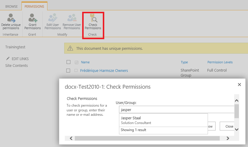
To look at it in more detail, especially if the document is shared with many people: Click Share > Shared With > Advanced. There you can open the group to see who is in there, or click Check permissions to check if a particular user has access to this item.

Check in more detail if a particular user has access to a document is accessible to many people

Check in more detail if a particular user has access to a document is accessible to many people

But it is better minimize this invisibility problem, so keep the security structure as simple and as clear as possible:

  • Avoid using item-level security, because you cannot see easily from the outside who has permissions to do what with the document (you have to click into the item menu to find out) and that increases the risk of mistakes and unexpected invisibility
  • Add people to groups like Visitors and Members rather than giving them read or contribute permission individually. Then it is easy to remove an entire group from a document library called ‘confidential documents’, for example.
  • Give “secret” libraries and sites a name that clearly indicates that not everybody has access to it.

So they are features, but users may perceive them as bugs and the invisible documents as ghosts. But fortunately it is possible to do some ghostbusting and make the documents as visible as they should be.

January 31, 2014

Install it and they’ll come? Not if it doesn’t meet their needs

Filed under: Adoption,Governance,SharePoint,Usability — frederique @ 16:40

The other day, I talked to someone about their plans to set up SharePoint 2013 in their company. The reason they wanted SharePoint 2013, was that their SharePoint 2010 environment was not used. They had not investigated why it was a failure. But from what he told me, it sounded like the IT department just built SharePoint and assumed that the users would come. And they didn’t.

Ummm, and what makes you think that installing a new version of SharePoint would make any difference?

The only way your SharePoint implementation is going to be a success is if:

  • Firstly, it meets the users’ needs and
  • Secondly, it gets adopted by them.

These things do not happen by themselves; you have to address some serious questions before you start installing and implementing your SharePoint and before you introduce it to the users. Obvious? Apparently not, as this was a real life example of an IT guy who seemed to think he could build it and they would come…

In this article I focus on five big questions that need to be answered so that you end up with a SharePoint environment that can be useful. In the next article, I will address adoption: how you can then get employees to actually use it.

1. What are the goals?

What are you trying to achieve with your environment? Building and introducing a SharePoint environment is not a goal. It is a means to an end, such as enhancing productivity, innovation and employee satisfaction in your organization.

Go into detail. Don’t just state that your goal is “more productivity, period”. Think about the goals of your organization, and what a tool like SharePoint could do to help you achieve these strategic goals.

And keep your eye on the big picture. Don’t aim for a narrow goal like implementing a standard way of working through SharePoint. I have heard that as a goal, and it sounds like you are forcing a tool on people that is solely dedicated to force a way of working on them. A recipe for disaster. You are trying to enable the employees to collaborate effectively and efficiently? Taking advantage of the best practices and recognisability offered by standardization is a way, if done properly. And yes, SharePoint can help with that.

Try to quantify your goals, although this is usually quite difficult. How much do you think you can save by improving productivity? A percentage of time that is no longer wasted and can be spent on other tasks? How many mistakes were made last year, because employees did not follow the standard way of working, that could be avoided? By how much could the number of service requests be reduced, because the employees can now help themselves? If the goal is more employee engagement: are you going to measure it by means of an employee satisfaction survey before and after and the result should be so many points improvement?

2. For who is it?

This ties in with the goals: who will work with the environment to achieve those goals? And don’t answer “Duh, the employees of our organization”. There are different groups of people in your organization, and these people may find themselves in different situations.

  • Is it for the Information Workers who work on a computer in their daily work?
  • Operational workers, like factory workers, who don’t have a company computer?
  • Sales operatives who are on the road all day and use a mobile device?
  • For corporate and local? And do these people all understand the same language?
  • New employees and veterans? Are they newbies or computer savvy?
  • For all departments or specifically for some departments who will benefit the most?
  • Only employees or also external parties like suppliers and partners?

If it’s all of the above for the environment as a whole, the different groups may well use different parts of the environment to fulfill their different needs. For example, the Information Works work on documents together, the factory workers look up procedures and request a shift change during a break, sales operatives align their schedules and share their findings after meeting with a client, the external parties work with employees in very specific projects.

In any case, it is very important to keep in mind who the users will be. Usually, SharePoint is not just for IT-people and not just for corporate people.

3. So what do you implement?

What should you offer these people to allow them to achieve their goals? It’s not enough to answer “Well, we offer them SharePoint”.

Even if you have decided that you will use only standard, out-of-the box SharePoint and don’t want any custom development, you still need to think:

  • What functionality are you going to take out of that standard SharePoint box?
    A portal for company news and information to make sure people are up to speed on the latest developments and official policies? Team sites for collaborating in teams? Document management functionality? Project sites to manage projects? Workflows to streamline processes? Integration with Office? Discussion boards and feeds to share ideas? Incorporating Yammer? Commenting and liking to stimulate feedback? Dynamic, search-based overviews that pull information from different sites?
  • How are you going to configure it so that it is handy for the user?
    Do you need separate sections with special security? Do you tie it all together with shared navigation or do team sites, for example, stand alone? Which elements do you put on the pages? With what views to focus on the most relevant items? Based on which content types equipped with which templates and information policies? And using which metadata to allow for clear structure and pertinent search results?
  • What will it look like?
    If it looks awful, it is a lot more difficult to convince people to spend time in the environment. Do you style SharePoint in alignment with your organisation’s style? Or another style? Can every site owner pick his or her own theme or should it be consistent across the entire environment? Do you create a rich look & feel for communication pages and a clean one for pages where users do their heavy duty work without getting distracted?

4. And are you checking with the stakeholders?

If you are an IT guy or gel, you can try to answer these questions by yourself. But don’t. You are doing this for other people in the organisation, so involve them to increase your chances of ending up with something they’ll like:

  • Are the goals aligned?
    The goals for your SharePoint environment should follow from the goals of your organisation. Does management agree with the goals and audiences you formulated?
  • Did you ask the different groups of users what they think of the old system and what they need?
    What do they hate and love in the previous SharePoint implementation or the other systems that you think of replacing with SharePoint? Did you do a survey, a focus group, interviews? Or at least ask around informally, if it’s a small-scale operation? Did you check the available analytics, to see which pages are visited?
  • Are you asking the different stakeholders what they think of your ideas along the way?
    Do you solicit feedback from users about the functionality you propose? Do you test the usability of the configured site, even if it is just by asking an innocent user to click through a test site and see where they click and what confuses them?

5.How will it be governed after launch?

Ok, you are building a great SharePoint environment that should meet the users’ needs. But will it keep up with real life, or will it fall flat after a while so that the users abandon it? You’ll need a governance plan that answers questions about, for example, Content Lifecycle Management. Don’t postpone thinking about governance until after you’ve launched, because then you may find your configuration at odds with the desired content management strategy, for example:

  • How do you keep the content fresh?
    Who will get the initial content in there in the first place? Who will write new stuff, update information, and delete what is no longer relevant? Do they need a publishing process of drafts, approval and scheduled publishing? Automated information management and what would the rules then be? Analytics to find out what is visited and what is not? These questions will have different answers depending on the type of content: corporate departments manage the organisation-wide information and site owners manage their own team site? In a team site, all members can contribute information?
  • Who will manage the elements?
    Site owners can manage their apps: add things like lists and libraries to their sites, and web parts to their pages? Can anybody create their own site for their team or project, or should they request it? Then who will process the request and what will be their criteria? Who decides a new section should be added to the portal? Who can add terms to the taxonomy?
  • How do you make sure the right people have the right access?
    Site owners manage the users on their own site? Internal and external users? Do you have sections, like a portal, that should be visible to everyone in the organisation? Then who manages that ‘everyone’ group? If you are using Office 365, what kind of licenses do you have and who is managing them?
  • How do you avoid technical disaster and who will fix things when they are broken?
    Do you have planned maintenance on the back-end? Do you have disaster recovery scenarios and are you sure they work?
  • How can users get the help they need to use SharePoint optimally?
    Do you have a helpdesk? A network of local “champions” that stimulate the users and help them out? Do you arrange class-room training, training videos, e-learning modules? Do you have help content? A community site where people can discuss SharePoint best practices?

With this last point about governance, we move towards the other part of making your SharePoint a success: adoption. Once you have launched the tool and arranged for it to stay gleaming and fresh, how can you get people to start using the tool and keep using it? But that is the topic of another article.

May 31, 2013

Twenty-four hours of digital workplaces

Filed under: Digital Workplace,Usability — frederique @ 22:31

DW24, twenty-four hours immersed in the world of Digital Workplaces. Guided tours, discussions, inspiration, lessons learned. Granted, I had to sacrifice most of my night’s sleep, but it was worth it.

This used to be the IBF24 marathon about intranets. But intranets have expanded so far into platforms for collaboration and social interaction that it makes more sense to talk about digital workplaces.

These are the things that struck me most:

  • A lot of participants emphasized that is it about meeting the business needs rather than the technology
  • Gamification can stimulate, but be careful how you use it, or it will just be “pointification” (Accenture has years of experience with this kind of motivational design)
  • Story-telling can work to engage: user tell their stories
  • Complete, integrated digital workplace is much appreciated (Virgin has a Cisco based platform for internal collaboration that includes voice messages and everything)
  • Organisations with customers or departments in Asia or Africa go for a “light” homepage (e.g. IBM: search and three boxes with a couple of headlines)
  • Homepages can be unusual (big personal picture and important links; XL, AMP) or -well- ugly (Weston) but if you can get to key content and functionality from there, it works…
  • Homepages usually contain: links to my tools and sites, news, social/culture elements. Some directly on the page, some behind a button.

February 28, 2013

Nielsen Intranet Annual 2013 Trends in the intranet world

Filed under: Usability — Tags: — frederique @ 20:08

A new year, a new Nielsen Norman Group Intranet Annual. As always, they have looked at a lot of intranets and picked the ones that are most useable and user-friendly. And don’t think “we use SharePoint so it does not apply to us”, as 70% of this year’s winners are on SharePoint! These some of their lessons learned and trends that resonated with me.

  • It takes time and people to make a great intranet
    In these days of tools like SharePoint that we can use out-of-the-box, creating an intranet is no big deal, right? Wrong! “Just because a tool lets you do something doesn’t mean it’s a good design solution for your users. Across the years, our winning designs have tended to be from organizations that customized an existing technology solution to fit their needs, rather than simply doing an out-of-the-box implementation. That is, team members took the time to understand the tool inside and out, and worked with the tool to meet their organizations’ needs.” [p.363]. So development of the winning intranets took 2,3 years on average and the team consisted of 18 people, including consultants.
    “It’s not fair to ask a tiny team to take on an endeavor as great as designing and managing an intranet, even if you are “simply deploying” an out-of box solution.” [p.7] You don’t just need to build something nice. You also need to embed it in the organization, finding out what the employees need, asking feedback, testing with them what works best and communicating to them what they can do with it. “Even the busiest development teams, or those with the craziest deadlines, should take time to watch people attempt basic tasks using the design” [p.363]
  • Involve the content owners from the start
    One of the classic goals of an intranet is that the employees can find relevant information on it. In that context, we often talk about the ways to find it, via the search function and smart navigation options. But there also has to be a good, up-to-date, readable and fitting story when you have found the page. The winners have made sure of that by involving the authors from the start and helping them with their work. Not just writing new stories, but also determining what needs to be migrated from the old intranet: restart from scratch or clean up the content. But whatever you do, don’t just copy over the entire garbage heap – garbage in, garbage out.
  • Manage the content well
    That attention to the content is not just needed in the beginning, but continuously: “For the past few years, great intranet teams have been emphasizing regular content updates and creating processes and workflows that religiously keep content up-to-date.” [p.25] We – and they – see a lot of intranets that fall into the trap of content pollution. Users have a hard time picking the nuggets of golden info from the heaps of garbage.
  • Findable content: Filters gebaseerd op metadata
    To find that content, users can filter it via faceted search, which is really taking off by now. That makes sense, because “one of the greatest issues with today’s intranets is that they house too much content for users to deal with in an IA or even typical search results, [so] employees are willing to manipulate results to find exactly what they want.” [p.23]
    This kind of smart search only works if the information has been labelled properly with metadata. Social tagging is a catalyst here, and we see that SharePoint’s options for entering metadata and tagging help as well, such as the term store with type-ahead functionality that makes it easy to tag consistently. But it still takes time and effort. So according to Nielsen structure and navigation is still the number one challenge for struggling intranets, and there is still too much information in silos where it can hardly be found. But the winners say that it is definitely worth the time and effort.
  • Full on social integration
    In earlier editions of the report and some intranets in my experience, commenting en tagging are isolated in a separate section of the intranet or even a separate site. But then I see that users do not visit that section and hardly anybody participates. Now you can get social and interact on all content everywhere in more and more intranets. “There shouldn’t be a sense that there is one place for users to share information, and another for them to consume information.” [p.366] Companies that are still hesitant to get too social can at least make it easy to find people with particular expertise, so that you can contact them offline.
  • Take immediate action when you have found somebody
    Using the people search, it is easy to find people and then to contact them. If you have SharePoint and Lync, this is out-of-the-box functionality that is quite helpful. And it is not only available via the people search, but you get these contact options anywhere, like in the Members web part displayed on the homepage of your team site.
  • Pseudo-personalized homepages
    Personalization of the homepage based on your role has become very popular, but it can be very tricky to keep that up-to-date and working properly. Many companies therefore they take a step back: they let the users select for example their language and company code, or the type of home page they want, like a marketing home page or a customer home page. It needs to be very clear to the users why they should select anything and how they should do it. If you do automate personalization, check with HR regularly of the profiles still make sense.
  • Integration with enterprise applications
    The winning intranets make it easy for the employees to get into other applications – they talk about apps, very hot & happening …. The apps are often put on the home page and/or in the main navigation. And you see the apps that fit your role and/or the apps that you selected. Of course then you want to be able to access those apps without logging on separately – Single Sign On.
  • Feeds from the outside world
    Intranets already had inward facing social features, now they also display Twitter, Facebook, LinkedIn and other social sites from the outside: “offering these features as part of the intranet news serves as a frequent reminder, enables speedy access, and demonstrates support for the organizations’ representation on social sites. It also sends a message to employees that they should care about what customers are saying” [p.22] I’ve seen RSS feeds from the internet before, but I also see this outward facing view get emphasized now.
  • Mobile hardly there
    For years we’ve all been saying that mobile is hot or should be hot. Last year, we were disappointed of the mobile presence in great intranets. And this year is no better: the researchers have found only one instance of a mobile application for a winning intranet: an app for de iPad, for sales people. The others do something for mobile access, but haven’t optimized anything for it, for security reasons, because it is too difficult to choose a platform, because there is no money to develop or manage it, or because they don’t know how to tackle it.
  • Collect feedback and communicate
    Build your intranet and the users will come? Not necessarily… The winners were very serious about communicating its benefits and collecting feedback from the users to improve the intranet: users can send an e-mail easily and from everywhere, fill in feedback forms, respond to discussions about the new intranet. During launch, this gets additional attention by way of a banner on important pages. And they really do something with the feedback, so that the users know it is worth responding.

November 30, 2012

What happened to the Title?

Filed under: SharePoint,Usability — Tags: , — frederique @ 22:24

SharePoint document libraries have separate fields for the file name (Name) and for a Title. That makes perfect sense to me, because they have different requirements:

  • The Name needs to be a unique file name, so that you do not overwrite a previous document.
    So for libraries with many documents and especially libraries with many contributors, we recommend a naming convention such as including your initials and the date. This is the ‘system field’
  • The Title need to be clear for people who try to find the file and to determine if this is the file they want to open.
    So you should enter a clear and clean title that does not contain codes and additions that make it less readable. This is the ‘people field’.

In “old” SharePoint, the Title field was clickable
We used the Title field in all views. The reader could click on the Title to read the file, the contributor could open the item menu from the Title to edit it in MS Office. The unique but unwieldly Name was invisible to normal users.

In “new” SharePoint, it is the Name field that is clickable
You have no option but using the .Name field in all your view, because otherwise nobody can read or use the file in any way… The only use I see for the Title field, is for the search engine.
This is the case in SharePoint 2010 but also in SharePoint 2013. I do hope that it is a temporary mistake in the trial cloud that I am looking at.

The file Name and Title

The Title is visible, but it is the Name that is clickable

In the SharePoint 2010 Online version that we are working in now, the Title field often is mandatory, because it is important for the search. But users are getting rather annoyed, having to fill in a field that has no immediate use in the site itself.

I know that there are scripts and workarounds to get a clickable Title field. But I would rather stick with out-of-the-box functionality than risk inconsistency and unstability from some band-aid.
What I don’t know why it is now the Name rather than the Title that is the active field.

What happened to the title? Why did it lose its clickability and – basically – its usefulness?

August 31, 2012

Let’s not cut the tree in half to fix the swing

Filed under: Usability — frederique @ 20:01

I had a flashback to the tree swing the other day. I felt like we were about to cut the trunk of the tree to fix a problem in SharePoint Online… NOOOOOO!  Fortunately we didn’t actually go there. Instead of continuing on the path of complication, we doubled back and simplified.

Thank you http://www.projectcartoon.com ! By the way, there are a few interesting new options in the classic tree swing project cartoon I hadn’t seen before, including a butterfly effect for its performance under load and the iSwing. And here’s another nice and very extended series of cartoons of what different teams can do to that poor tree swing, including health & safety inspectors…

It’s a balancing act
Our starting point in the development of this SharePoint Online intranet was to use the platform as much as possible “as is”. No development in the sense of programming. No customizations; just deciding which elements of the product we should take out of the box and how we should configure them and put them to use. This starting point makes sense, given the fact that we are in the cloud and we want to float along with any updates and upgrades.But we have flown way beyond that starting point now.

The goal of the intranet is to help the employees do their jobs. And the standard out of the box functionality is just not good enough for an intranet of hundreds of team sites that help thousands of employees collaborate, share knowledge and follow their business processes efficiently. Fortunately, we can actually talk to the users down the hall, so we don’t have to guess as much as the cartoon projects working for the swing customer…

So we had to customize. And then deal with the complications caused by the customizations. It’s a balancing act, between functionality and usability on the one hand, and maintainabillty and feasibility on the other hand.

Oh well, we not only have a tree swing, but also a see-saw and a tightrope in our playground…

May 31, 2012

Just asking our users with a SharePoint Online survey

Filed under: SharePoint,Usability — Tags: , , — frederique @ 22:55

From time to time, we just need to ask the users what they think of our intranet. A survey is a nice tool to get some answers. We don’t aim for scientific accuracy, but for a sense of the intranet’s usability, what works for the users . In a previous post, I discussed a survey we set up when we started developing a new intranet. That survey was implemented in a standard survey list template of WSS2, the SharePoint version 2003.

Standard survey in SharePoint Online

Now we wanted to ask some follow-up questions. And by this time, we have entered the cloud. So we created a survey using a standard list template in SharePoint Online. And that is definitely better:

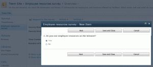
  • The survey questions open in a dialog box, so that the user concentrates on answering them, instead of getting distracted by the context and risking to lose their answers when they leave the form.
  • Branching depending on the answers the user gives, so that you get different follow-up questions when you answer that yes, you do us some section of the intranet
  • Better exports to spreadsheet of the results
Respond to survey

Respond to the survey, in a dialog box

Linking to the survey

Once we had set up the survey, we wanted to invite our users to respond to the survey and explain to them what it is about and why their feedback is important, in an invitation e-mail and an article on the intranet. With a link to start the survey right away. However, that was not as easy:

  • The direct link leading to the questionnaire form (/ResourceSurvey/NewForm.aspx) opens it in the context of the list

    O365-Survey in list context

    NewForm opens in the list context

  • Adding ?IsDlg=1to the url (/ResourceSurvey/NewForm.aspx?IsDlg=1) removes the background, but now the survey form looks lost and when the users has finished the survey he actually is lost: he ends up on a blank screen.

    O365-Survey no context

    NewForm.aspx?IsDlg=1

  • It does work if you put it in a script:
    <a href="javascript:var options=SP.UI.$create_DialogOptions();
    options.url='https://companynet.sharepoint.com/survey/Lists/ERC/NewForm.aspx?IsDlg=1';
    options.height = 400;void(SP.UI.ModalDialog.showModalDialog(options))">
    <strong>Start the survey</strong></a>

    However, if we put this on a news article page, SharePoint automatically strips out the code.

So we put the code inside a Content Editor Web Part on the news article page, so that the script remained intact and worked!

By the way, this method implies that we had to use a news article rather than a blog post, because we could not insert a web part in a standard SharePoint blog post.

March 31, 2012

Intranet trends 2012 according to Nielsen

Filed under: Usability — frederique @ 20:47

The intranet world according to Nielsen is evolving and keeps getting improved. It is getting more social, but not more mobile as fast as we’d like. I always like to read the yearly Intranet Design Annual – The Year’s 10 Best Intranets….

Some trends from the report….

  • Mobile is not growing as expected
    Only 1 of the 10 winning intranets has a mobile version, which is disappointing after the good results in last year’s report (see 2011 annual post) .
  • Information Architecture and navigation
    “The great intranet designers today know that an intranet’s foundation is its IA, and that they should begin working on it early in the design process.”
    • Centralized IA to bridge silos
      Team sites give teams have a place to work, but the risk is that the teams only see their own ‘silo’ sites and miss what happens elsewhere. Nielsen sees that several of the winners have managed to create a central Information Architecture that accommodates everyone. Also, this year’s intranets are particularly good at linking content together in a manageable web for the users
    • Innovative menus
      Several of the winners use mega-menus, with category sections, to give a better overview of what’s available and quicker access to lower levels. One winner also has a mini-dashboard of icons on each page, with short cuts to key content.
      Nielsen stresses that the winning teams thoroughly tested their nonstandard menu interfaces and and iterated their design. Otherwise you may end up with something that looks spiffy but is incomprehensible and un-usable.
    • Customizable targeting 
      Targeting helps the user to focus on what’s relevant, but that backfires if the user does not fit in a neat pigeon hole. The trend Nielsen sees is to allow users to select a different role (e.g. for a different location) to browse other content.
  • Content is still king
    • Include it in the design process
      In order to get a better feel for the content and how it would fit on your pages, don’t use “lorem ipsum” dummy test but real content, right from the beginning.
    • Multimedia are going strong
      Photos, videos and other multimedia continue to play an important role. An interesting example are recordings of customer service phone calls, that focus all employees on the customer.
    • Languages continues to be a challenge
      In multilingual companies, the primary language is often used for the general pages, while specific local content is in the local language.  Some companies translate company-wide into several corporate languages. And some countries leave it up to the author, asking them to tag it with the language.
  • People and social
    • Quick access to co-worker information
      The winners make it easy to find interesting people, like experts, and ask them questions.
    • Wall feeds integrated with profile pages
      We know ‘writing on the wall’ from social media like Facebook. This years, such feeds appeared on intranets as well.
    • Supportive and accessible management
      Executives are sharing information on many intranets and they do it well.
    • Celebrating personal content
      Employees are people as well, so many intranets not only encourage business content, but personal content as well.
  • Engage and interact
    • Feedback to encourage participation
      Contributors want to know how much interest there is in their content. Some winners provide metrics to the content owners, and some even make these metrics visible so that everyone knows who are top contributors.
    • Collaborative approach to design
      Most of the winners actively involved key people in the design process, via user tests and informing stakeholders, in the different locations. One company even invited all employees to join the planning calls in the early stages.
    • Commenting continues
      Most of the winners offer the option to comment on pages and articles. Usually people comment on controversial topics, and on articles that end with an explicit call to action or question.

“When employees switch between using the web and their company intranets, they shouldn’t feel like they’ve gone from driving a 2012 ZL1 Camaro to a 1989 Chevy Nova with faulty brakes”

Right you are mister Nielsen!

October 31, 2011

Just ask the users

Filed under: Usability — Tags: , — frederique @ 23:46

We are about to start developing a new version of our intranet, where we use ‘intranet’ in the broad sense of the word: internal network for communication, collaboration, knowledge sharing and process support. The current version of the intranet is over six years old, so it is about time….

As we do have an existing intranet and we do have employees currently using that, we naturally asked them what they use, like and dislike about it. So we sent out a survey.

Survey

We wanted to get results quickly, as input for discussion. And we had no budget for outside help. So we kept things as simple yet effective as possible.

  • A standard SharePoint survey list template.
    Quick to set up and users could easily access it, and we knew for sure it would work on the old IE6 browsers that are still all over the company.
  • As simple and “free” as possible for the user:
    • Four ‘rating scale’ questions: rate several intranet features on a Likert scale from 1 to 5
    • Two multiple choice questions about what they use and what they want
    • Three fields where they could optionally add comments in a free text field
    • Users could answer anonymously, a point we stressed in the invitation.
  • Language versions: We created different versions
    We were afraid that the users who are less fluent in English would not respond to an English language survey, but we wanted to capture their opinions. We had no time or budget for official translators, so I translated the survey and invitation myself, helped by Google Translate and some nice native speaker colleagues.
    Note: Don’t rely on Google Translate! It gives you a nice starting point, but it also give you hideous mistakes in every sentence.

    • The main survey in the company language (English), sent to random users in the UK, Australia, The Netherlands and Belgium.
    • Separate versions in the main “alternative” languages (French, German and Spanish), sent to random users in those countries.
  • Invitation: We sent an e-mail inviting their participation in the different languages (with the names in the hidden Bcc field), in which we explained why we needed their input.

Meta-results

We’ve learned from the results, not only about the way to improve the intranet but also about doing surveys.

  • Quick and dirty works
    We could set up a survey, get responses and interpret them roughly within a week and a half.
  • Free text fields work
    The multiple-choice questions give us quantitative results. But the free text fields told us a lot as well: not only what they say, but also their tone of voice, tells us what they feel strongly about and what frustrates them most. And several users gave us great ideas, thoughtful analyses of the problems they encountered and their preferred solutions.
  • Language versions work
    We worried that the users in the non-English speaking countries would not be using the intranet and therefore be unwilling to respond to the survey. But we received about 30% response from them, including a lot of free text comments, the same as for the ‘standard’ survey. Was that because we asked them in their own language?

Tidbits from the results

  • Search needs to be improved
    Our search has technical problem and it is pretty bad. And the search is always a hot topic in Nielsen’s Intranet Design Annuals (see this previous post). So it is not a surprise that our users are very vocal about the need for improvement.
    “The search functions of is an absolute nightmare.”
    “I do not use the search functionality at the moment, because I simply never can find what I’m looking for”
  • The intranet needs to be faster
    No matter how useful the intranet is and how appealing and user-friendly the pages look, the user will be unhappy if it takes too long before the pages is loaded. If it is too slow, they will get completely frustrated, or just stop using it.
    “If I have to wait for a page to open for at least 15 seconds (or more!), I would only use the intranet if I had no other option, like now. ”
  • Language issues
    As we feared (and as I blogged before), the non-English speaking users would definitely prefer to get an intranet in their own language. We had no multiple-choice question about that, but several people in each language group gave this comment. Including a Dutch participant, who were supposed to be able to handle English without any problems…
    “¡ Intranet en castellano ! ”
    “Meine Anregung wäre, das man alle Seiten in deutscher Übersetzung wählen kann. “

    “Je sais que ce n’est pas forcement evident, mais il faudrait que les communications vraiment importantes devrait être traduite en français.”
    “Please in Dutch should be easey “
  • But we know why we work so hard to improve the intranet
    Fortunately, the results are also encouraging: most people use the intranet multiple times a day and they think it is important for the business, though they all see a lot of room for improvement.
    “Don’t get me wrong, I use all the above a lot, not having these tools available will be a real nightmare. ”

Ok, we have received a lot of useful feedback. Let’s get started with that redesign!

Older Posts »

Powered by WordPress