As I’ve said before: SharePoint lists are powerful, and we use them to great effect, for example, to keep track of our tasks in project sites.
On the homepage, we typically display the tasks that are most relevant for the user: the tasks assigned to me, the ones whose deadline is nearest displayed at the top. High priority tasks are either in a separately filtered webpart, if there is enough room, or mixed in with the rest and hopefully the displayed priority label draws enough attention.
However, any users, especially ones familiar with Excel, have asked me to highlight the overdue high priority tasks. Or to highlight the status of projects that are in trouble in a long programme management list. Good point. And fortunately, in 2010 I have that in my toolbox: SharePoint Designer 2010 that is.
Conditional formatting with SharePoint Designer 2010
SharePoint Designer 2010 allows me to highlight list items that are important according to my criteria, as a no-code solution, without any programming. Just follow the wizards.
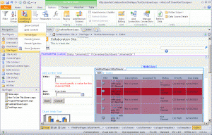
- Open the page where you want to highlight these important list items. In my example, I open the task dashboard page.
- I put the cursor in the task list, and the ribbon displays the option Conditional formatting.
- I want to highlight the task that is important, so I select Format Row.
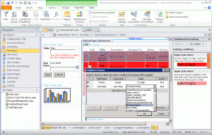
- In the Conditional Criteria pop-up, I set the criteria for the tasks I consider important enough to highlight: overdue high prio tasks. So Priority is High and the Due Date is less than the current date.
- Click the Set Style button, to determine what these overdue high priority tasks should look like.
- In the Modify Style pop-up, I set the background color to red and the fond type to bold, so that these tasks will really stand out. At the bottom of the pop-up, I can see a preview of the result.
- I already had some tasks entered in my project site. So as soon as I click OK, SharePoint Designer shows WYSIWYG what those tasks look like; you don’t have to go to the browser. But you can also see it in the browser.Br>
In this manner, you can combine criteria. In my example, I made sure that overdue high priority tasks are bright red, and overdue tasks of lower priority are a lighter color, but still more visible that the standard white tasks that haven’t met their deadline yet.
It took me a few trials and errors to find out would be most clear, but fortunately, you can easily change the conditional formatting.
In the example discussed above, we highlighted entire rows, drawing attention to an important task as a whole. But you can also apply this conditional formatting to specific fields, which correspond to cells in the displayed list.
For example, in a project lists we consider the status of different aspects, such as the schedule and the resources of a project. These add up to an overall status, but we also want to see immediately what the status of these aspects are. For that, we put conditional formatting at the level of the cell: instead of indicating that we want to format a row, we select the TD cell element and then choose the option Format selection. And then we can set the style to visualise literally of that aspect of the project is in the red.

Conditional formatting on specific fields: is this specific aspect of the project in the red or is it green?
A nice way to help the users handle their information overload, by ensuring they see what’s most important for them.


Nice article, does this method also work for personal views?
Comment by Nils Freriksen — April 24, 2012 @ 10:51