blog.frederique.harmsze.nl my world of work and user experiences

May 31, 2012

Just asking our users with a SharePoint Online survey

Filed under: SharePoint,Usability — Tags: , , — frederique @ 22:55

From time to time, we just need to ask the users what they think of our intranet. A survey is a nice tool to get some answers. We don’t aim for scientific accuracy, but for a sense of the intranet’s usability, what works for the users . In a previous post, I discussed a survey we set up when we started developing a new intranet. That survey was implemented in a standard survey list template of WSS2, the SharePoint version 2003.

Standard survey in SharePoint Online

Now we wanted to ask some follow-up questions. And by this time, we have entered the cloud. So we created a survey using a standard list template in SharePoint Online. And that is definitely better:

  • The survey questions open in a dialog box, so that the user concentrates on answering them, instead of getting distracted by the context and risking to lose their answers when they leave the form.
  • Branching depending on the answers the user gives, so that you get different follow-up questions when you answer that yes, you do us some section of the intranet
  • Better exports to spreadsheet of the results
Respond to survey

Respond to the survey, in a dialog box

Linking to the survey

Once we had set up the survey, we wanted to invite our users to respond to the survey and explain to them what it is about and why their feedback is important, in an invitation e-mail and an article on the intranet. With a link to start the survey right away. However, that was not as easy:

  • The direct link leading to the questionnaire form (/ResourceSurvey/NewForm.aspx) opens it in the context of the list

    O365-Survey in list context

    NewForm opens in the list context

  • Adding ?IsDlg=1to the url (/ResourceSurvey/NewForm.aspx?IsDlg=1) removes the background, but now the survey form looks lost and when the users has finished the survey he actually is lost: he ends up on a blank screen.

    O365-Survey no context

    NewForm.aspx?IsDlg=1

  • It does work if you put it in a script:
    <a href="javascript:var options=SP.UI.$create_DialogOptions();
    options.url='https://companynet.sharepoint.com/survey/Lists/ERC/NewForm.aspx?IsDlg=1';
    options.height = 400;void(SP.UI.ModalDialog.showModalDialog(options))">
    <strong>Start the survey</strong></a>

    However, if we put this on a news article page, SharePoint automatically strips out the code.

So we put the code inside a Content Editor Web Part on the news article page, so that the script remained intact and worked!

By the way, this method implies that we had to use a news article rather than a blog post, because we could not insert a web part in a standard SharePoint blog post.

April 30, 2012

Anywhere – SharePoint Online on my Windows Phone

Filed under: Interaction,Office365 — Tags: , — frederique @ 22:18

We are always on, always connected. And we expect to be able to do that on our mobile devices. But we’d better manage those expectations.

Nielsen, in his latest Intranet Design Annual, laments the fact that very few intranets have a mobile version. Recently, I looked into SharePoint Online on my iPad and I was only moderately enthusiastic. Now let me take a look on my smartphone – a Windows Phone, so it is Microsoft all around. Today, I focus on the interface in the mobile Internet Explorer.

Bottomline: Again, quite a lot actually works, but not everything…

What works:

  • Announcements, Links, Custom lists
  • Tasks, including views like My Tasks and functionality to update tasks.
  • Blogs: read the post, read the comments and add a comment
  • View pictures in a library, including their thumbnails and a screen-filling version

What works somewhat:

  • Adding a task worked, because I saw the new task appear on my computer. Unfortunately I did not see it appear on my phone…
  • Calendar is present but unpractical: no weekly or monthly overview.
  • Document libraries: I can read documents – though not in a very practical way on such a small screen. But I cannot add or edit them in the phone browser: there is no Upload document button. For that, I need to open the Office Hub.
  • Picture libraries offer a button to upload a picture, but that did not work for me – I could not activate the Browse option.
  • Movies (mp4) played from their library, but the media webpart to play it from the page does not work.
  • Publishing page libraries show the table of content, but the pages themselves do not open.

What is missing entirely: the more interactive features:

  • Discussion Boards: Missing from All Site Content and I cannot switch on the mobile view in the list settings
  • Surveys: Idem
  • Rating: I can see the rating stars but I cannot rate a document on the phone

Below, you will find some screenshots and other details…

‘Table of Contents’

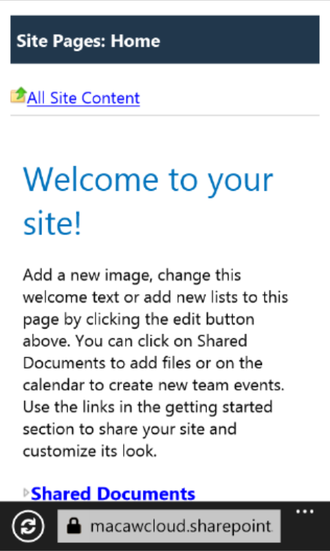
The Windows Phone wisely does not attempt to display the site in its big screen view, but more like a table of content. The All Site Content overview is your friend, as other navigation options – like the tabs – are missing.

Homepage

Homepage on my Windows Phone

All Site Content

All Site Content

Blog

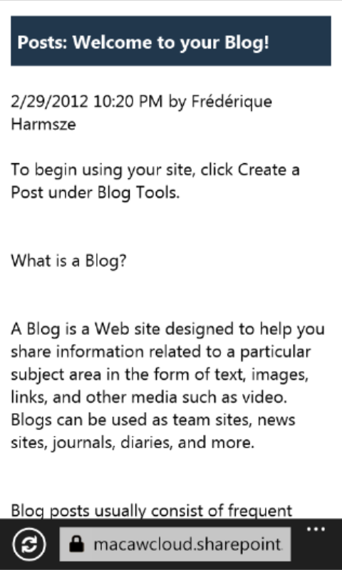
I can read blog posts, read the comments and add a comment using my Windows Phone.

Read a blog post

Read blog comments

Add comment

Managing my tasks works

I can view the tasks that are assigned to me, update their status and other data, and switch to the view with all tasks. For the selection fields, this is the Windows Phone method.

My Tasks

My Tasks

Edit Task

Update my task

Edit Task - Selection list

Select a status

Libraries
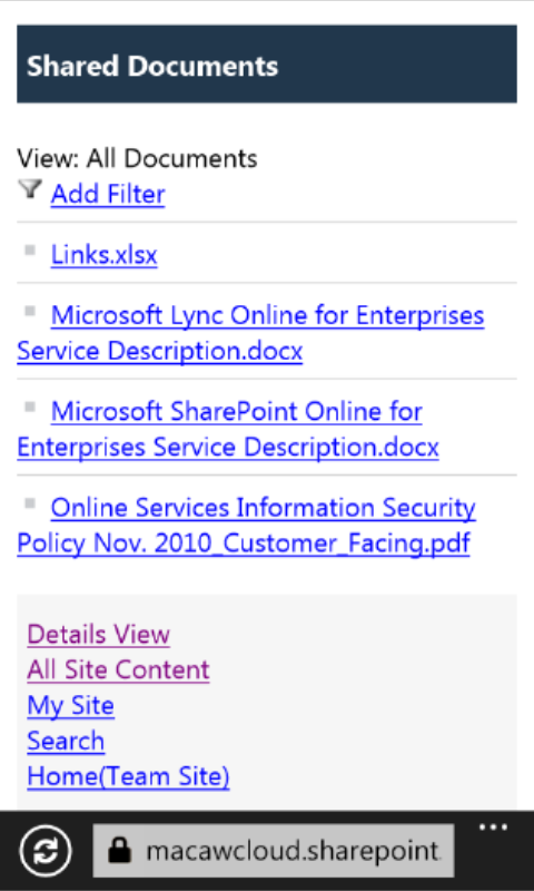
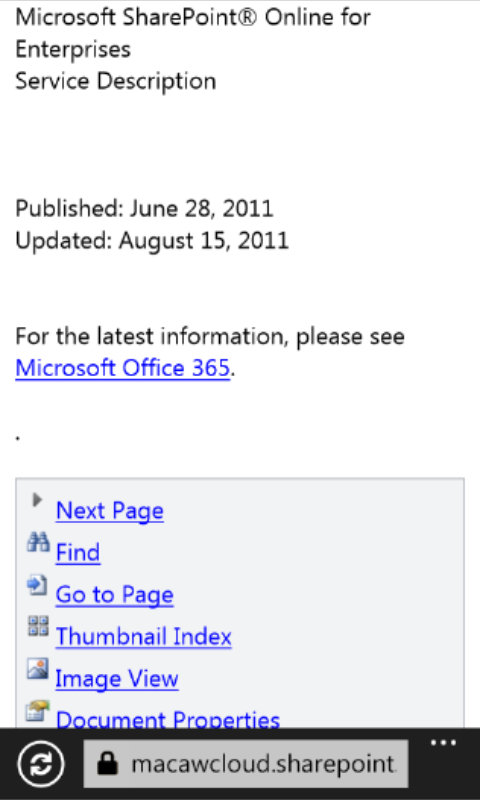
The reader can consult the information in document libraries and picture libraries. Talking back is more difficult in the windows phone browser: I cannot upload or edit the files.

Document Library

Document Library

Document

Document

Picture Library

Picture Library

By the way, I have made these screenshots using the Windows Phone Emulator of the SDK (Software Development Kit) . I am not planning any real development myself, but I have not found an app or any other tool to shoot the screen of my Windows Phone directly.

March 31, 2012

Intranet trends 2012 according to Nielsen

Filed under: Usability — frederique @ 20:47

The intranet world according to Nielsen is evolving and keeps getting improved. It is getting more social, but not more mobile as fast as we’d like. I always like to read the yearly Intranet Design Annual – The Year’s 10 Best Intranets….

Some trends from the report….

  • Mobile is not growing as expected
    Only 1 of the 10 winning intranets has a mobile version, which is disappointing after the good results in last year’s report (see 2011 annual post) .
  • Information Architecture and navigation
    “The great intranet designers today know that an intranet’s foundation is its IA, and that they should begin working on it early in the design process.”
    • Centralized IA to bridge silos
      Team sites give teams have a place to work, but the risk is that the teams only see their own ‘silo’ sites and miss what happens elsewhere. Nielsen sees that several of the winners have managed to create a central Information Architecture that accommodates everyone. Also, this year’s intranets are particularly good at linking content together in a manageable web for the users
    • Innovative menus
      Several of the winners use mega-menus, with category sections, to give a better overview of what’s available and quicker access to lower levels. One winner also has a mini-dashboard of icons on each page, with short cuts to key content.
      Nielsen stresses that the winning teams thoroughly tested their nonstandard menu interfaces and and iterated their design. Otherwise you may end up with something that looks spiffy but is incomprehensible and un-usable.
    • Customizable targeting 
      Targeting helps the user to focus on what’s relevant, but that backfires if the user does not fit in a neat pigeon hole. The trend Nielsen sees is to allow users to select a different role (e.g. for a different location) to browse other content.
  • Content is still king
    • Include it in the design process
      In order to get a better feel for the content and how it would fit on your pages, don’t use “lorem ipsum” dummy test but real content, right from the beginning.
    • Multimedia are going strong
      Photos, videos and other multimedia continue to play an important role. An interesting example are recordings of customer service phone calls, that focus all employees on the customer.
    • Languages continues to be a challenge
      In multilingual companies, the primary language is often used for the general pages, while specific local content is in the local language.  Some companies translate company-wide into several corporate languages. And some countries leave it up to the author, asking them to tag it with the language.
  • People and social
    • Quick access to co-worker information
      The winners make it easy to find interesting people, like experts, and ask them questions.
    • Wall feeds integrated with profile pages
      We know ‘writing on the wall’ from social media like Facebook. This years, such feeds appeared on intranets as well.
    • Supportive and accessible management
      Executives are sharing information on many intranets and they do it well.
    • Celebrating personal content
      Employees are people as well, so many intranets not only encourage business content, but personal content as well.
  • Engage and interact
    • Feedback to encourage participation
      Contributors want to know how much interest there is in their content. Some winners provide metrics to the content owners, and some even make these metrics visible so that everyone knows who are top contributors.
    • Collaborative approach to design
      Most of the winners actively involved key people in the design process, via user tests and informing stakeholders, in the different locations. One company even invited all employees to join the planning calls in the early stages.
    • Commenting continues
      Most of the winners offer the option to comment on pages and articles. Usually people comment on controversial topics, and on articles that end with an explicit call to action or question.

“When employees switch between using the web and their company intranets, they shouldn’t feel like they’ve gone from driving a 2012 ZL1 Camaro to a 1989 Chevy Nova with faulty brakes”

Right you are mister Nielsen!

February 29, 2012

Anywhere – SharePoint Online on my iPad

Filed under: Office365 — Tags: , , — frederique @ 23:54

One of the selling points of SharePoint Online is that you can access it anytime, anyplace, anywhere – where you have an internet connection. Not just in the office, but also on the train, on your couch at home. And in the board room. That flexibility rimes with iPad for many people these days.

I’ve heard from several executives that they prefer to work on their iPad. They don’t want to waste money and trees on paper prints and they also don’t want to lug around a heavy laptop. So they asked their teams to send documents for meeting as pdf by e-mail, allowing them to read on their iPad. But sending documents by e-mail is soooo last century. We prefer sharing such information in SharePoint teamsites.

My question then was: can you actually use a Microsoft SharePoint site on an Apple iPad or do they just clash?
The answer fortunately is: quite a lot actually works, though not everything.

Documents

On the iPad, I see the document library and I can read a document in the browser. But I was unable to upload a document.

Homepage of an out of the box teamsite on the iPad

Read an Office document in the browser

Uploading a document did not work

Task list and calendar

I can add and edit items in lists like Tasks and Events on the iPad. The interface in the pop-ups looks a bit different, but they seems to work anyway.

Adding a task that depends on a selected predecessor

Adding an event to a calendar

Comments and notes

I can read a blog post and its comments, and also comment on a blog post. On the My Profile page, I can update my status. But I cannot publish a note in my Note Board.

Blog

Commenting on a blog post

Updating my Profile status works, but adding a note to the Note Board not.

No silverlight

The one gaping hole on my iPad is Silverlight. Because of that, I cannot play video in the official video web part. And I cannot view the spiffy version of the organisation chart in My Profile. The page does offer me a link to download and install Silverlight, but that soon hits the ‘Download failed’ wall, as there just is no Silverlight for the iPad.

I cannot install the Silverlight required for the nice organisation interface

The video web part requires Silverlight, so the video is not played within the page but opened on the iPad itself via the link.

Also, my iPad only plays videos in mp4 format. I know there must be apps that allow me to view wmv videos for example. But until then I am restricted to mp4.

January 31, 2012

Barriers to a successful adoption of the intranet

Filed under: Adoption,Governance — frederique @ 23:08

We’re developing a new intranet at my client. But we know we don’t just need a great system – we’ll also need things like communication and governance to make it a success. So we’ve been looking at the barriers that the users may encounter and how we can overcome them.

Generically, we see the following barriers to a successful adoption of intranet features and the following solutions for it:

  1. Don’t know about it. So:
    • Communication: Intranet, local communication vehicles, announcement mailing
    • Getting started kit: show and tell what’s available, in the site and outside (flyer, QRC)
    • Champions: drive adoption
  2. Cannot access it. So:
    • Opens by default in browser
    • Simple URL: redirect if technical url too hard
    • Invitation: get account data on Day 1 (user management)
    • Support for forgotten account data (ongoing user management)
  3. Don’t understand how to use it, afraid to mess up. So:
    • User friendly site
    • Help content, link to help and handy navigation + search within help
    • Policies
    • Training of contributors of News, Blogs and Files
    • Support in case you get stuck
  4. I see nothing relevant here. So:
    • Make sure the site works (incl good performance)
    • Relevant content at the start
    • Ongoing relevant content (content governance)
    • Releases of relevant new features
  5. Not worth the effort to contribute, what’s in it for me. So:
    • Incentives (recognition, games, gadgets,..)
    • Management commitment: it’s part of your job
  6. Disappointed in the lack of response. So:
    • Set an example (e.g. HR)
    • Champions make extra effort
  7. No time for it. So:
    • Management commitment to make time for it
  8. Afraid to stick out their neck. So:
    • Set an example (e.g. HR)
    • Open culture where management encourages contributions actively

December 31, 2011

Happy New Year – In the Cloud and here on Earth!

Filed under: Office365 — frederique @ 16:28

I wish you all the best for 2012, wherever you are!

For me, 2011 was the year I ended up In The Cloud for real. In particular: Office 365. We are doing a SharePoint Online project, so we are only seeing part of the cloud so far. But hopefully we’ll expand and start using Lync Online and Exchange Online later.

The jump from SharePoint 2003 to The Cloud

At this client, we are currently working in an – immensely customized – SharePoint 3003 environment and Office 2003. It is a big multinational, with a lot of corporate inertia and legacy applications that clash with the modern world. So the jump from SPS 2003 and WSS 2.0 to SharePoint Online is huge as it is. What we need to do in any case:

  • Upgrade our Internet Explorer 6 (yes, six!) to IE 8, because SharePoint Online simply does not work on IE 6.Fortunately we’ve finished that for almost all users now. And yes, we know that IE 9 is already upon us, but we didn’t want to make the roll-out even messier.
  • Upgrade our MS Office from 2003 to 2010, because when the client signs with Microsoft for Office365, he agrees to be on at least the current version of Office minus one.Actually, the old office is not as much of a handicap as the old browser, as long as you use SharePoint Online as a communication platform. Luckily we’ve postponed the more advanced functionality, that requires serious office integration, until a later stage. So we’ll have some time to roll-out the new office.
  • Migrate what is still relevant from the old portal and team sites to the new platform. Content, but also business solutions created via smart configuration of team sites.Because our old SharePoint was customized so heavily, there was no way to automatically upgrade the whole thing to a newer version of SharePoint. So we’ll have to create a new platform and configure that in such a way that it meets the users’ needs on each level and then get the existing content in there. We’ve been asking site owners to clean up their sites and delete what is no longer relevant, so that we won’t be wallowing in dead sites and irrelevant content by the time we start migrating.

A new intranet for a company that does not exist yet

Complicating this jump even further is the major reorganization that is going on: the company is split into two separate companies. The half I am in, will be a completely new company, with a new name, new vision, new style, new everything.

Unfortunately, these details of the new company have not been announced yet. So I find myself in the challenging position of designing and developing an intranet for a company that does not exist yet and whose particulars are mostly secret so far. For example:

  • Our main aim is to support the business, so we try to consult the stakeholders in the business. But what are our key business segments and business processes now? And who are our key people, moving forward?
  • The user accounts for the new company are not available yet. And the user account of the old company cannot be connected to SharePoint Online, because there are too many items in the Active Directory. But we still want to launch a first version of the intranet as a communication platform, to facilitate communication about the split and the new company. So for the first months, we’ll all get a separate account for SharePoint Online, with which we’ll have to log on manually.
  • The style is not available yet, so the visual designer will have to work very quickly and in secret between the time the basic look & feel of the company gets developed and the moment when we aim to launch the first version of the intranet.

Happy New Year in the cloud

These complications of jumping to the cloud from a prehistoric environment while the company is being split is half would make any project exciting. In addition, SharePoint Online itself generates plenty of excitement.

Some of that is positive: “Wow, with my test account I can experience the cloud, comment on the news and write a blog post and it looks great.”

And some of that excitement is negative: “I can’t believe it is so slow” [fortunately Microsoft fixed that]. “And why is there not a good poll available?”

Bottomline: we are happy to move all our users into the cloud in 2012, but we still have our feet on solid ground. And most of all:

Happy new year!
Happy New Year

November 30, 2011

Metaphorical interlude: my blackberry is frozen

Filed under: New world of work — frederique @ 23:48

Ok, this sketch is almost a year old. But when I rewatched it recently, it still made me laugh out loud, so let me share it here…

And no, my phone’s not a blackberry, but it still gets frozen….

While we’re at it:

Dilbert.com

Dilbert.com

The New World of Work huh….

October 31, 2011

Just ask the users

Filed under: Usability — Tags: , — frederique @ 23:46

We are about to start developing a new version of our intranet, where we use ‘intranet’ in the broad sense of the word: internal network for communication, collaboration, knowledge sharing and process support. The current version of the intranet is over six years old, so it is about time….

As we do have an existing intranet and we do have employees currently using that, we naturally asked them what they use, like and dislike about it. So we sent out a survey.

Survey

We wanted to get results quickly, as input for discussion. And we had no budget for outside help. So we kept things as simple yet effective as possible.

  • A standard SharePoint survey list template.
    Quick to set up and users could easily access it, and we knew for sure it would work on the old IE6 browsers that are still all over the company.
  • As simple and “free” as possible for the user:
    • Four ‘rating scale’ questions: rate several intranet features on a Likert scale from 1 to 5
    • Two multiple choice questions about what they use and what they want
    • Three fields where they could optionally add comments in a free text field
    • Users could answer anonymously, a point we stressed in the invitation.
  • Language versions: We created different versions
    We were afraid that the users who are less fluent in English would not respond to an English language survey, but we wanted to capture their opinions. We had no time or budget for official translators, so I translated the survey and invitation myself, helped by Google Translate and some nice native speaker colleagues.
    Note: Don’t rely on Google Translate! It gives you a nice starting point, but it also give you hideous mistakes in every sentence.

    • The main survey in the company language (English), sent to random users in the UK, Australia, The Netherlands and Belgium.
    • Separate versions in the main “alternative” languages (French, German and Spanish), sent to random users in those countries.
  • Invitation: We sent an e-mail inviting their participation in the different languages (with the names in the hidden Bcc field), in which we explained why we needed their input.

Meta-results

We’ve learned from the results, not only about the way to improve the intranet but also about doing surveys.

  • Quick and dirty works
    We could set up a survey, get responses and interpret them roughly within a week and a half.
  • Free text fields work
    The multiple-choice questions give us quantitative results. But the free text fields told us a lot as well: not only what they say, but also their tone of voice, tells us what they feel strongly about and what frustrates them most. And several users gave us great ideas, thoughtful analyses of the problems they encountered and their preferred solutions.
  • Language versions work
    We worried that the users in the non-English speaking countries would not be using the intranet and therefore be unwilling to respond to the survey. But we received about 30% response from them, including a lot of free text comments, the same as for the ‘standard’ survey. Was that because we asked them in their own language?

Tidbits from the results

  • Search needs to be improved
    Our search has technical problem and it is pretty bad. And the search is always a hot topic in Nielsen’s Intranet Design Annuals (see this previous post). So it is not a surprise that our users are very vocal about the need for improvement.
    “The search functions of is an absolute nightmare.”
    “I do not use the search functionality at the moment, because I simply never can find what I’m looking for”
  • The intranet needs to be faster
    No matter how useful the intranet is and how appealing and user-friendly the pages look, the user will be unhappy if it takes too long before the pages is loaded. If it is too slow, they will get completely frustrated, or just stop using it.
    “If I have to wait for a page to open for at least 15 seconds (or more!), I would only use the intranet if I had no other option, like now. ”
  • Language issues
    As we feared (and as I blogged before), the non-English speaking users would definitely prefer to get an intranet in their own language. We had no multiple-choice question about that, but several people in each language group gave this comment. Including a Dutch participant, who were supposed to be able to handle English without any problems…
    “¡ Intranet en castellano ! ”
    “Meine Anregung wäre, das man alle Seiten in deutscher Übersetzung wählen kann. “

    “Je sais que ce n’est pas forcement evident, mais il faudrait que les communications vraiment importantes devrait être traduite en français.”
    “Please in Dutch should be easey “
  • But we know why we work so hard to improve the intranet
    Fortunately, the results are also encouraging: most people use the intranet multiple times a day and they think it is important for the business, though they all see a lot of room for improvement.
    “Don’t get me wrong, I use all the above a lot, not having these tools available will be a real nightmare. ”

Ok, we have received a lot of useful feedback. Let’s get started with that redesign!

September 30, 2011

SharePoint Online: looking good

Filed under: Office365,SharePoint — Tags: , — frederique @ 22:51

I’m heading for an interesting Office 365 project, where we’ll start with SharePoint Online and Lync Online. In our preliminaire work, we’re looking at the Fabrikam demo for SharePoint Online and it is definitely looking good….

Screenshots
The homepage does not look like SharePoint at all (except for the Site Actions that I get as the administrator). And that goes down very well with people who are fed up with the standard SharePoint look & feel.

Fabrikam demo - Home page

Fabrikam demo - Home page

The overview pages also look nice and ‘website-like’.

Fabrikam demo - Overview page

Fabrikam demo - Overview page

One of the examples is a request form created in InfoPath for a visually interesting and user-friendly experience.

Fabrikam demo - Request form

Fabrikam demo - Request form

Once we get down to the lists and libraries, we recognize SharePoint 2010.

Fabrikam demo - Document Library

Fabrikam demo - Document Library

Sources

August 31, 2011

Duds – Why do some solutions fail?

Filed under: Adoption,Governance,Usability — frederique @ 23:56

I’ve been developing small-scale information worker solutions for the same company for a few years now. Different departments and teams needed different solutions to solve their problems in the domain of communication, collaboration and the optimization of business processes. And because I am still here, some time after we’ve launched the solution, I can see where it all led.

Well…

On the one hand, some solutions are still a great success, helping the teams to increase productivity and quality, and reduce cost and frustration.

On the other hand, other solutions completely fell flat. They have never been used for real, and got swept out ignominiously as a dead site by the house-keeping team.

What went wrong with those duds? It’s not always clear, but these seem to be important negative factors.

Solving no problem.
We create a solution – in my case usually specific functionality in a teamsite – to solve a problem. We identify that problem in the beginning, with a rough business case. However, sometimes an expected problem does not actually arise. So the solution is sitting there in a vacuum, solving nothing of substance.

An example that I encountered recently, was a solution for issue tracking in a high profile project. When I asked after a few weeks why I did not see any issues in the tool, the answer was that there were no issues so far…
Maybe I should see that solution as an insurance policy: you hope you don’t need it, but you make sure it’s there just in case your house burns down or – in this case – the project gets swamped with issues. Unfortunately, I fear they did find issues later on. By then, original project leader had left, probably nobody remembered that they had this tracking tool and they solved the problem some other way.

So: If you create a solution for a problem that hasn’t arisen yet:

  • Double-check that they need the insurance.
  • Keep it as simple as possible, to avoid wasting too much time.
  • Make sure the team know about the solution, so that they can start using it as soon as the problem does arise.

Functionality insufficient
We do our best to create a solution that meets the users’ needs. But sometimes the result just isn’t good enough. In my case, the available platform and toolkit definitely limit what I can create. In other cases, the technology may be up to it, but the budget it too restricted to get the job done.

An example that I won’t forget in a hurry is a sales tool for a Russian team. We knew from the beginning that we were pushing the envelope. But as the project progressed, it became clear that it just wouldn’t work. The American third party tool didn’t understand the Russian date format. The client became more emphatic that his huge amounts of data needed to be connected in multiple ways. And there just was no way that we could solve the problems in a reliable way. In the end, even the parts of the tool that did work, were never used and the entire solution was deleted in our last spring cleaning campaign.

So:

  • Identify the full extent of the client’s needs at the beginning of the project, especially complex showstoppers.
  • Double-check that you have grasped the essence and that you have a solution, especially if there are further complications, like a language barrier (I don’t speak Russian any better than that third party tool that got stuck on the date format…).
  • If there is no good solution, cut your losses and stop the project. Launching an inadequate, unstable solution will only make your life harder, when they call you to save them when it collapses.

Usability insufficient
Our solutions are created to help employees be more productive, or more generally: help the users reach their goals. That will only work, if the solution is user-friendly: if the users can do their job quickly, easily and pleasantly.

With on a fixed, old platform, usability of any of its solution is sub-optimal, to say the least. For instance, readers see an Edit button and only discover they do not have the required permission when they try to save the item and all their content is gone. And when contributors enter metadata, there is no connection between the data they enter. So if they first select a country and then a city, the selection list of cities is not pe-filtered. Stupid system…

However, sometimes a solution is not user friendly just because it is an IT system, regardless of its “objective” usability. I’ve sat next to users who told me “No no no, this is just too difficult for me“, until I pointed out that – basically – they just had to click the prominent button ‘Upload document’ to upload a document. “Hm, that’s actually quite easy”. Such users don’t feel friendly towards any new system, because it always takes some energy to check out something new, and they don’t see it as their core business. But that has more to do with user adoption driven by management commitment.

So: optimize usability as far as possible

  • Determine who the user groups are and what they need, and cater for their needs specifically. For example, remove the Edit buttons from pages that are mostly visited by readers who cannot use them anyway.
  • Test this with real users, even if it is very informally: just drop by and see what they do. I see a lot of interesting things when visit my less intranet-savvy contacts. They sometimes click in very unexpected places…
  • If you can’t use technology to make things clear and the fixed styles don’t give you any help, be as clear as you can in text and sorting:
    Include the right words in title bars, link texts, explanatory texts, document titles.
    Order the content in such a way that the information that is most important to most users is at the top of the page, at the very least above the fold: most recent documents, my tasks, key links, etc

User adoption insufficient
A solution can be set up brilliantly, if the users don’t use it, it is still a dud. Of course none of the solutions I created were absolutely flawless. But I have seen good solutions ignored for other reasons.

One of the solutions where we really made a huge effort to make it as functionally useful and user-friendly as possible, is a program management tool. The project teams of the individual projects should update the project status and other key indicators in the tool, so that all participants can monitor the program’s progress and the program managers can intervene where needed. But most project leads just don’t do it. The tool is not that difficult to use. But determining the status and key indicators of the project is difficult. So they are very reluctant to adopt the process itself, let alone the tool they can use to facilitate that process.

Another example I’ve just encountered, concerns a very savvy project lead, who is definitely able to handle both the process and the solution he could use to make that process more efficient. But he insists on using some “old fashioned” solution that he has always used and that he is completely fluent with. Except that it is rather unpractical for collaboration with the other stakeholders. In this case, the main obstacle for adoption is probably the ‘Not Invented Here’ syndrome.

So:

  • First of all, the users need to understand how it all works. Ensure that the users know what the business process is and how to handle that. And then how the solution can help them with it and how to use it exactly. So provide training and help material, both concise (FAQ, quick reference) and more detailed (user manual, help pages). Even if they don’t consult the material, many users feel more secure in the knowledge that it is available if they need it.
  • Communicate not only theoretical knowledge to the users, but also a clear sense of what’s in it for them: how will this make their life easier (saving them time and effort) or richer (informing them better than before).
  • Is this an important business process? Then using the tool to make that process flow more efficiently is a core task for the participants, and not just something they can ignore. This implies that management commitment is needed and the managers need to act upon their commitment.

Management commitment insufficient
In the context of intranets, the goals that the employees are trying to achieve – with or without using one of our solutions – fall under the responsibility of a manager. If the manager feels that the goals will be achieved more effectively and efficiently using a tool, they can ask us to develop such a solution. But then the managers are also responsible for the adoption, usage and maintenance of that solution, even if they delegate the actual work to another employee. However, I’ve seen quite a few solutions fail because of a lack of management commitment.

For several solutions, including what was supposed to be an important tool to aid marketing strategies, my contact for the entire project was an intern or another temporary employee. I knew the names of the responsible managers, but I never got any input or feedback or questions from them. So when the temporary employee left, the entire project just stopped.
That marketing tool was almost finished two months ago, and it still is almost finished. An HR site was almost finished two years ago, and it is still gathering dust without any further progress. The positive only example was the HR site for another country, where the intern managed to launch the site before he left. That is a rather static information site, so it does not matter as much that it has not changed since then, because at least the information is available for the readers.

In some other projects, the managers were personally involved, but the solutions still failed, because the managers did not see them through. In one case, the most eager sponsor left the company. The other one had very little time, as complications within the organisation distracted her. I noticed that she lost her enthusiasm for the project, but I was unable to re-energize her. The fact that she was in Australia and I was in The Netherlands played a role: we could only have a real time conversation in the hour after my midnight and at the start of her work day. That solution had cost us a lot of effort and was ready for launch, But it was never used and flushed out in our last spring cleaning.

So:

  • Don’t do a project with an intern without on-going involvement from the responsible manager. If they won’t do more than just give the order to develop a solution, then it apparently is not important enough.
  • Get more explicit and well-founded Go/No Go decisions: Is the problem that we are trying to solve still serious? Do you still think you can achieve the benefits? Can we take a sprint to finish the solution with a burst of energy? Or should we just stop wasting time on something that is just bleeding to death?.
  • Make it clear that they need to invest some time now, in order to save a lot of time later, when the solution allows them and their team to work more efficiently.

Most of these reasons for duds to fall flat don’t have anything to do with technology, but with people. So getting a cool new toolkit is not going to help me get more solutions up in the air and soaring to great heights. It’s

getting a cool new toolkit
AND
determining exactly what solutions I should create with it to allow users to reach their goals
AND
making those solutions so user-friendly that they will get their quickly, easily and without frustration
AND
getting the users up-to-speed with its workings and eager to use the solutions
AND
Ensuring management commitment so that the tool that facilitates key processes is considered key as well.

« Newer PostsOlder Posts »

Powered by WordPress