blog.frederique.harmsze.nl my world of work and user experiences

September 29, 2010

[SharePoint2010] Ribbon context sensitivity includes the browser and windows version

Filed under: SharePoint — Tags: , , — frederique @ 21:27

Hey, what happened to that ribbon option I used yesterday? Now it’s greyed out and I get a message that ‘This control is currently disabled’. What happened?

Library ribbon in Firefox

No Upload Multiple Documents in Firefox 3.6

What happened is that I was working on another computer yesterday, that has another browser and windows version.

At first sight, SharePoint 2010 seems to work just fine in any of my environments – at least after I stopped trying in Internet Explorer 6. Which made sense, as I had heard that SharePoint 2010 works with different browsers. But I hadn’t looked at the fine print yet.

So I was surprised to see that, for example, in Firefox 3.6 the Datasheet view, Open in Explorer and the option Upload Multiple Documents do not work. Also, the Sync to SharePoint Workspace and Connect to Office do not work on that machine, maybe because it is running Office 2003.

Library ribbon in IE8, Office 2010 and Windows 7 versus Firefox, Office 2003 en Windows XP

Library ribbon in IE8, Office 2010 and Windows 7 versus Firefox 3.6, Office 2003 and Windows XP

Another example: In Windows XP, the option Upload Multiple Documents does not offer drag & drop functionality. That does not depend on the browser, as my IE8 didn’t help, but on the Windows Explorer functionality of Windows itself it seems.

Upload Multiple Documents by drag& drop works in IE8 Windows 7

Upload Multiple Documents by drag& drop works in IE8 Windows 7

And I am still not sure why the options E-mail a link, Download a Copy and Send To are disabled when I select more than one document in the library or a document set. Even in IE8 and Windows 7. Didn’t these work in the beta? Am I doing something wrong or have they been disabled by design?

At least now I know that the ribbon is not just sensitive to the context IN the site, but also to the context OF the site. And if I really want to see what my options are, I take my newest computer, with IE8, Office 2010 and Windows 7.

For the details, see this Technet article Plan browser support (SharePoint Server 2010).

August 31, 2010

[SPD2010] Conditional formatting – highlighting what’s hot

Filed under: SharePoint — Tags: , , — frederique @ 20:59

As I’ve said before: SharePoint lists are powerful, and we use them to great effect, for example, to keep track of our tasks in project sites.
On the homepage, we typically display the tasks that are most relevant for the user: the tasks assigned to me, the ones whose deadline is nearest displayed at the top. High priority tasks are either in a separately filtered webpart, if there is enough room, or mixed in with the rest and hopefully the displayed priority label draws enough attention.

However, any users, especially ones familiar with Excel, have asked me to highlight the overdue high priority tasks. Or to highlight the status of projects that are in trouble in a long programme management list. Good point. And fortunately, in 2010 I have that in my toolbox: SharePoint Designer 2010 that is.

Conditional formatting with SharePoint Designer 2010
SharePoint Designer 2010 allows me to highlight list items that are important according to my criteria, as a no-code solution, without any programming. Just follow the wizards.


  1. Open the page where you want to highlight these important list items. In my example, I open the task dashboard page.

  2. I put the cursor in the task list, and the ribbon displays the option Conditional formatting.

  3. I want to highlight the task that is important, so I select Format Row.
    Conditional formatting: an option in the ribbon for the selected list

    Conditional formatting: an option in the ribbon for the selected list


  4. In the Conditional Criteria pop-up, I set the criteria for the tasks I consider important enough to highlight: overdue high prio tasks. So Priority is High and the Due Date is less than the current date.

  5. Click the Set Style button, to determine what these overdue high priority tasks should look like.
    Condition criteria pop-up

    Condition criteria pop-up


  6. In the Modify Style pop-up, I set the background color to red and the fond type to bold, so that these tasks will really stand out. At the bottom of the pop-up, I can see a preview of the result.
    Modify style pop-up

    Modify style pop-up


  7. I already had some tasks entered in my project site. So as soon as I click OK, SharePoint Designer shows WYSIWYG what those tasks look like; you don’t have to go to the browser. But you can also see it in the browser.Br>
    Conditionally formatted list seen in the browser

    Conditionally formatted list seen in the browser


In this manner, you can combine criteria. In my example, I made sure that overdue high priority tasks are bright red, and overdue tasks of lower priority are a lighter color, but still more visible that the standard white tasks that haven’t met their deadline yet.
It took me a few trials and errors to find out would be most clear, but fortunately, you can easily change the conditional formatting.

Changing the conditional formatting

Changing the conditional formatting, based on the WYSIWYG presentation in SharePoint Designer

In the example discussed above, we highlighted entire rows, drawing attention to an important task as a whole. But you can also apply this conditional formatting to specific fields, which correspond to cells in the displayed list.

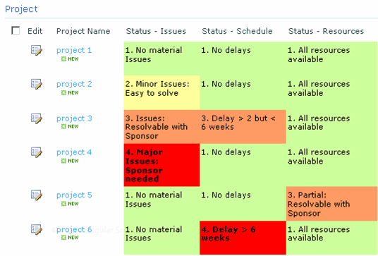
For example, in a project lists we consider the status of different aspects, such as the schedule and the resources of a project. These add up to an overall status, but we also want to see immediately what the status of these aspects are. For that, we put conditional formatting at the level of the cell: instead of indicating that we want to format a row, we select the TD cell element and then choose the option Format selection. And then we can set the style to visualise literally of that aspect of the project is in the red.

Conditional formatting on specific fields

Conditional formatting on specific fields: is this specific aspect of the project in the red or is it green?


A nice way to help the users handle their information overload, by ensuring they see what’s most important for them.

July 23, 2010

[SharePoint Designer 2010] Alternative options for list forms

Filed under: SharePoint — Tags: , , — frederique @ 23:33

SharePoint lists are powerful. For instance, team members can enter their tasks in a task list on their site and update them as they go, so that the entire team can monitor how they are doing. In another example, we created a projects list, where projects managers entered the main information about their project and updated the status of their projects regularly. That allowed higher level management to keep track of the program as a whole.

In these lists, we can include many fields, to capture all relevant information. Great.

However, if you are not careful, you end up confronting the poor user with a huge edit form, even if he only needs to update a status field at that time. In the old SharePoint, we could only change the order of the fields and add descriptions to give the form some structure and highlight the fields that are most important most of the time.

In 2010 (not just the year, I mean the SharePoint), we can create alternatives for adding and editing these list items, in addition to the default forms. We can even promote our new edit form to the default option. Also, we can put a version of the form to create a new item directly on the homepage of our site.

How to create alternate edit options
For instance, we need a short version of the form for editing tasks, that the team members can use to do a quick update, without being hampered by fields that are irrelevant at that point. How to do that?

Open the site in SharePoint Designer 2010 and click to the tasks list. On the right hand side of the summary page, you see the forms that are available in the list, such as the default edit form EditForm.aspx.
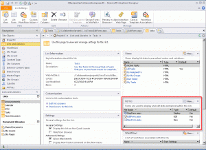
Summary of the Tasks list in SharePoint Designer 2010, with  the Forms section

Summary of the Tasks list in SharePoint Designer 2010, with the Forms section

Click the New button in the forms section and enter the settings of the new edit form we want:

  • An edit form,
  • Set as the default, so that the edit icon in the list opens this new Update Task form.
  • Select ‘create link in the list item menu and ribbon’ so that this option also appears in the list item menu, in addition to the standard Edit Item. And type in the label that should be displayed in that menu.
Settings of the new list form in SharePoint Designer 2010

Settings of the new list form in SharePoint Designer 2010

When you click OK, UpdateTask.aspx is added under the heading Forms. To determine what the user should see in that Update Task form, click that form name.

To remove unwanted fields, click Add/Remove columns in the ribbon. Or simply remove that row in the table. In addition, you can format the form to highlight the most important field, such as the status label in the screenshot below.
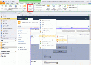
Customizing the new list form in SharePoint Designer

Customizing the new list form in SharePoint Designer

Once we have saved this customized form, it is available in the site.
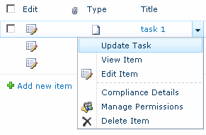
The new edit option in the list item menu in the site

The new edit option in the list item menu in the site

And clicking on the edit icon opens the short form we just created.

The customized short form Update Task in the site

The customized short form Update Task in the site

How to put the New item form directly on the page
For the edit options discussed above, the user has to click an edit icon or open the list item menu to start editing. For creating new items, we sometimes want the user to start typing directly on the page, without clicking any New Item buttons.
SharePoint Designer 2010 allows us to do that: insert the actual form on the homepage of your site or on a specially created dashboard page. How to do that?

Open the page where you want to add that new item form in SharePoint Designer (Edit file).
Put your cursor where the form should appear, click Insert > New Item Form in the ribbon, and Select your list.

InSert the new item list form directly on a page in SharePoint Designer 2010

InSert the new item list form directly on a page in SharePoint Designer 2010

Then you can customize the form that has landed on the page. The default version of the ne w task form is very sober, so we add the field Assigned To. We remove the fields Modified and Modified by in the same pop-up window.

Adding and removing columns to customize the form on the page

Adding and removing columns to customize the form on the page

Once you save the page, you see this quick form for creating new tasks on the page.

Quick form for new tasks directly on the page in the site

Quick form for new tasks directly on the page in the site

So with SharePoint 2010, we can give users options to add and edit their tasks and other items more quickly and easily.

June 23, 2010

DIWUG slides 22 juni : SharePoint 2010 [dutch]

Filed under: SharePoint — Tags: , , — frederique @ 07:41

This is for the Dutch Information Worker User Group, hence the Dutch talk and slides http://www.diwug.nl

Dit zijn de slides die ik gisteravond heb laten zien in mijn DIWUG presentatie (ppt, 4MB):

No-code information worker solutions met SharePoint Designer 2010
Kenniswerkers willen effectief en efficiënt samenwerken. Met SharePoint 2010 kunnen hiervoor nog betere oplossingen gerealiseerd worden. En met SharePoint Designer 2010 kunnen we die oplossingen gebruikersvriendelijker inrichten en uitbreiden, zonder te programmeren.
In deze sessie kijken we vanuit een functioneel perspectief naar een paar van dit soort oplossingen en hoe je ze kunt configureren met SharePoint Designer 2010.
Spreker: Frédérique Harmsze – Macaw

May 31, 2010

Smart validation right out-of-the-2010-box

Filed under: Interaction,SharePoint — Tags: , — frederique @ 23:47

In SharePoint list and libraries, we can always specify if a particular field is required or not. For example, documents in a library have to be categorized, issues have to be assigned to somebody and tasks need a status, which can be ‘Not started’ of course.

In real life we often need smarter validation than just making a field required. To avoid messing up your process, a start date should be before the end date. To avoid losing money, the discount you give should be smaller than the actual cost of the item. And to avoid bothering your users, they should not have to fill in fields that are not important for this item. For example, high priority tasks really need a Due Date, which you can just skip for lower priority tasks.

Validation: the Due Date is required because the Priority is High

Validation: the Due Date is required because the Priority is High

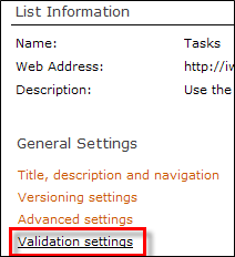
In 2010, you can actually specify the validation settings for your list, in a formular with the available columns. This only works for “calculable colums”, not for multiple lines of text or lookups. If the formula is true, then you can save the item. And if it is false, then you need to fix the problem. You can specify the error message as well.

Link to the validation settings

Link to the validation settings

So, with the formula =IF(Priority=”1. High”,IF([Due Date]<>””,TRUE,FALSE),TRUE) we can ensure that high priority tasks always get a Due Date.

Validation settings

Validation settings

Now of course none of this ensures that the users actually enter sensible Due Dates or that they adhere to them. But we have at least made it a bit easier to enter the right data.

April 30, 2010

Queens’s day Amsterdam: interaction design in the city

Filed under: Interaction — Tags: — frederique @ 23:41

A city is a system. Today that was very apparent in Amsterdam.

It was queen’s day, when we celebrate the queen’s birthday (the fact that she was actually born in January in no way diminishes the festivities. You can’t have a national party in January, so we stick with the previous queen’s birthday). About 750.000 people came to celebrate in the city center of Amsterdam, which is not that big to begin with.

Queen's day Amsterdam on Flickr

Queen's day Amsterdam on Flickr

So the organizers tried to optimize the interaction between these crowds and the city.

Main personas for queen’s day are based on young people wearing orange clothes and wigs who drink a lot of beer, and children trying to make some money selling their old toys and playing music. For these kids specific areas were reserved, so that they would not be overrun by the beer-drinking crowds. For these beer-drinking crowds, bars were available everywhere (that served special events beer I believe, which is not to strong, to decrease public drunkenness), as well as toilets at strategic locations for the output.

The organizers planned the flow: many people would go for the open-air concerts. So these were planned on big open spaces. And they planned routes to get there from train stations via wide roads: the optimum flow that the leads the users of your system quickly and easily to their targets.
There were official events in different locations and they encouraged people to use other train stations than the central station, for load balancing.

Flows planned by the organizers

Flows planned by the organizers

The buses and trams did not run in the city center at all today. They would not be able to pass without running over the crowds. It was annoying that the bus we wanted to take did not stop where we had hoped it would be. But of course you can’t just put features in your system that are efficient for some people while endangering everybody else.

These routes were sign-posted and managed via electronic screens that could broadcast messages like “Rembrandt square is full” (i.e. don’t even try to go there). When part of your system is overloaded, you want your users to avoid it. Otherwise they will just get frustrated and, in trying, they will aggravate the overload.

Actually, there were two flows: the pedestrians in the streets and the people in boats in the canals. These flows were not entirely independent: the pedestrians often stopped to watch the antics of the boaters – we’ve seen some near-shipwrecks. And the boaters often landed, probably to get more passengers or supplies. Not all of your users are following the same path, but their paths may cross.
Cross-roads offer navigational options but they also were the places were we got stuck the most.
For the boats, it often got interesting at the low bridges that were hiding “cross roads” in the canals. You don’t see the other guys coming while you are maneuvering carefully and trying not to hit your head.
For the pedestrians, the most challenging cross-roads were the ones that had a bar on or near them: the flows arriving from different directions all just got stuck in the crowds that were getting drinks. If people are supposed to get somewhere, don’t put something in their way that will distract them, get them confused or simply stop them in their tracks because everything is just overloaded.

Flow on the water

Flow on the water

The police were present on the canals and on the streets. From what I saw, they were friendly, helpful and just available to keep an eye on things and provide help where needed. And they wore bright yellow shirts so that it was very easy to find them when you needed them. Just what you want your help desk and system administrators.

And in case anyone is worrying: I did not spend the entire day thinking about interaction design. I had a great time enjoying the festivities, the atmosphere and the sunshine with my friends. These interaction challenges were just part of the fun…

March 31, 2010

Stuck in digital self service

Filed under: Usability — Tags: — frederique @ 16:25

In my job, I design and develop solutions that should provide a good user experience. But sometimes it is me who is the innocent user experiencing a site or a service. And that user experience is not always very nice. Fortunately, my annoyance is tempered by the fact that I can learn from it for my own work.

So far so good…
My telephone company wants to save trees (and money, I suppose), so they have stopped sending me phone bills on paper. I am all in favour of that, because I don’t mind saving trees and I dislike being swamped in physical paperwork in any case. I find it easier to consult my paperwork in digital form, on a site that I can access without having to dig for hefty folders on a remote shelf.
 
My phone company is also promoting self service. I am in favour of that too, because it allows me to do whatever I need to do at a time that suits me, which is usually outside normal office hours.

Where it went wrong… 
So why am I unhappy? Because they have automated and secured their systems in such a way, that I was completely stuck until I got new hardware…

I had created an account years ago, when they had started this service. But I’d never used it and forgotten all about it. Until I needed it recently.

Of course I had forgotten my password by then. You can request a new password, but that is sent to your mail address: an old address that I cannot access anymore. And you can only change the e-mail address when you are logged on using the password I could not remember – I called the service desk but they could not change it for me, because that would not be secure. Hm.

They also offer a way to change your account using your telephone: Call from the phone for which you want to reset your account and press the required buttons. But that only works on a ‘modern’ phone that can make the beeping sounds. Mine didn’t do that. Calling from another phone does not work, because they have to recognize that you are calling from this particular number. Hmmm.

In any case, I could not find on their website what I had to do. They offer a nice wizard that should answer your questions. But in that wizard, they assume that you have the latest version of their service deals and a modern phone. Apparently, dinosaurs with old telephones are supposed to be consistent and contact them the old-fashioned way: pick up the phone and avoid the new website. Hmmmmm….

So…?
I had enough of this mess and bought a new telephone. With that, I could reset my account. And I made sure I stored the account information in a safe place, so that I’ll be able to find it when I need it. Problem solved.

Apart from that, this experience as an innocent user who just tries to get the job done has taught me this:

  • Security and user friendliness really don’t get along. I already knew that of course, but this rubbed my nose in it again.
  • Allow people to create their own username and password. They are far more likely to remember those.
    Allow them to request a new password, sent to their e-mail address when they answer their secret question correctly. This doesn’t help people who changed e-mail addresses but it does help people who stick to their e-mail accounts.
  • Remember that not all users have the latest version of your products or the latest tools. Cater for them as well in your service and in your help content. List the older versions or at least include a generic option ‘Other’.
  • Create an escape option for users who get stuck. For instance, if you have no reliable e-mail address for self-service, allow people to send a copy of their contract and reset their e-mail address for them. Or allow them to call an operator on their old, beepless phone and let the operator perform the tasks that the phone cannot handle by computerized wizard.

February 28, 2010

2010 shortcuts for editing document properties

Filed under: SharePoint — Tags: , — frederique @ 23:52

Ok, I’m not implying that now there are more than 2010 shortcuts. But I do mean that in SharePoint 2010 and Office 2010 we have some new and some improved shortcuts for editing the properties of documents stored in a team site. We want to edit these properties, for example, to provide or change a description and to select a category.

In the document library, we can now use the classical edit icon, drop-down menu and datasheet, as well as the new inline editing option. And in Word, we not only have the document information panel, but also the new backstage view.

Updated classics: Edit icon, drop-down menu and properties form in the Document Library

We still have the classic drop-down that already offered the Edit properties option in 2003. Now we have an updated version, which has more options.

Selecting the option Edit properties or clicking the Edit icon opens – as usual – the form where you can edit these properties. The update here is that the form is opened in a ‘pop-up layer’ instead of a separate page.

Updated classics: Datasheet view in the Document Library
To edit the properties of multiple documents at the same time, we still have the Datasheet view. This view now is offered as a button in the new ribbon.

New: Inline editing in the document library view
In the 2010 Document Library, we can edit the properties that are displayed in the view directly, by way of inline editing. The properties displayed in the view are the most important properties, which we want to change most often.

For that purpose we do need to enable inline editing in that view. In the ribbon, click Library > Modify View > Inline editing > Allow inline editing.

Modern classic: Document information panel in Word
When we create a new document from the document library, using the New Document button, Word opens with a Document Information Panel at the top. Hhere we can enter the properties straightaway. We already had that in 2007.

New: Backstage view in Word
In 2010, we have a new and improved ‘backstage view’. Here we can not only see the properties of the document, but we can also edit them inline. So we don’t have to go back to the document library to edit the properties, while we are working in Word.

We’ve always had more than one way to perform a task in a team site. That is a good thing, because the user does not always approach from the same angle, with exactly the same purpose. So the user can choose the method that best suits her needs at that time. And now we have some more options that allow us to get the job done more easily.

January 1, 2010

Happy 2010 !

Filed under: SharePoint — frederique @ 20:30

I wish you all a happy 2010. And I mean both happy “twenty ten” SharePoint and Office and a happy new year “two thousand and ten”.

It feels a bit weird, to see the name of our new SharePoint suddenly appear as a real-life year. We have been talking about and – later – playing with 2010 for most of 2009. And now it actually is 2010 and things get serious… Microsoft will launch it officially in the first half of 2010, so that probably means June, or May if we’re lucky.

On January 18 and 19 I will attend the SharePoint Connections conference in Amsterdam http://www.devconnections.com/SPEurope/ . A great chance to find out more about the new tool and to discuss it with colleagues outside Macaw – inside Macaw we fortunately already have plenty of opportunities for that, but it’s nice to meet other SharePointers a swell. Maybe I will see you guys there?

In any case, I wish you all the best for the new year!

December 31, 2009

SharePoint 2010: Interface of the Public Beta

Filed under: SharePoint — Tags: — frederique @ 17:51

In my previous post, I could only show images of the “secret” Beta. Here is what the Public Beta looks like by default. It’s not shockingly different from the secret beta, but is has evolved a bit.

Public beta - content page

Public beta - content page

They have cleaned up obvious obviously beta-looking things, like the language labels: instead of ‘en-us’ you see the full ‘English’ (I’m not sure what happened to the ‘us’ versus ‘uk’ distinction).
The Quick Launch has been styled. They have added an overview of ‘Recently modified’ to the Quick Launch.
On the other hand they have removed clutter from the ribbon, such as the separate buttons for ‘Edit HTML Source’  and ‘Convert to XHTML’ that have been moved into one dropdown called HTML. I guess the audience is not supposed to need single click HTML code manipulation.

So I suppose this will basically be what the launched product will look like – until you customize the look & feel of course.

« Newer PostsOlder Posts »

Powered by WordPress